

Table of Contents
- Understanding Stadium Lighting and Background Challenges
- Choosing a Color Palette That Works in Stadium Settings
- Matching vs. Coordinating Family Outfits for Stadium Photos
- Family Game Day Outfit Ideas for All Ages
- Mixing Patterns and Textures Without Visual Clutter
- The Importance of Layers and Fabric Movement
- Common Mistakes to Avoid When Coordinating Stadium Photos
- Final Styling Tips for a Standout Photo Session
Last Updated: August 6, 2026
Understanding Stadium Lighting and Background Challenges
Stadium environments present unique photographic obstacles that most family photo guides completely overlook. The combination of artificial lighting, shadows cast by stadium structures, and unpredictable weather creates color cast issues that can ruin an otherwise perfect coordinated outfit. Understanding these challenges before you choose your family's game day colors is the difference between photos you'll treasure and ones you'll want to retake.
Stadium lighting typically comes from overhead fixtures designed for gameplay, not portraiture. These lights often have a greenish or yellowish tint that can wash out skin tones and distort your carefully chosen color palette. The shadows are equally problematic, stadium seats, railings, and architectural elements create harsh lines across faces and bodies. A neutral tone that looks perfect indoors may appear sickly under stadium lights, while bold prints that photograph beautifully in natural light can look washed out or overly vibrant depending on the angle.
The background itself matters tremendously. Unlike a studio or outdoor park setting where you control the backdrop, stadium backgrounds include bleachers, signage, crowd members, and field infrastructure. A color that clashes with these elements will make your family appear disconnected from the scene rather than part of it. Conversely, colors that complement the stadium's dominant hues, typically greens (field), grays (concrete and metal), and team colors, will make your family feel integrated into the environment.
Season and time of day compound these issues. Evening games under artificial lights create different color problems than daytime games with natural sunlight streaming through stadium openings. Winter games may have lower, warmer afternoon light if you're shooting during pre-game warmups, while summer games at night are purely artificial. Recognizing these variables before selecting your family's outfit prevents the disappointment of photos where everyone looks washed out or color-distorted.
Choosing a Color Palette That Works in Stadium Settings
The right color palette for stadium photos starts with understanding which colors photograph well under stadium conditions and which ones create visual problems. Your goal is to create visual harmony that works with the stadium environment rather than against it.
Neutral Tones and Complementary Colors
Neutral tones are your foundation for coordinating matching family stadium photos that will look good regardless of lighting conditions. Whites, creams, soft grays, and blacks create a cohesive palette without fighting the stadium's dominant colors. These neutral tones provide a clean canvas that allows team colors or complementary accent colors to stand out without overwhelming the frame.
The key insight most guides miss: neutral doesn't mean boring. A cream-colored shirt paired with navy accents creates more visual interest than white with the same navy, because cream photographs warmer and more forgiving under artificial light. Soft gray works beautifully in stadium settings because it sits between the cool tones of concrete bleachers and the warm tones of skin, creating balance.
Complementary colors, colors opposite each other on the color wheel, work well when used as accents rather than the dominant piece. If your family is wearing neutral bases, adding complementary colored accessories (scarves, hats, or team-spirit gear from Merch by Mary Ellen) creates focal points without creating visual clutter. A family in cream and gray bases with burgundy accents will photograph cohesively even under challenging stadium lighting.
Avoiding Color Cast Issues
Color cast happens when artificial light shifts how colors appear in photos. A blue shirt might look purple under certain stadium lights, while a red shirt might appear orange. The solution isn't to avoid these colors, it's to choose shades that are forgiving under color-shifted lighting.
Jewel tones, deep blues, emeralds, sapphires, and burgundies, photograph better under artificial light than pastels or bright primary colors. These richer tones absorb light rather than reflecting it directly, which means they maintain their integrity even when stadium lights shift the color temperature. A family wearing jewel-toned coordination will look intentional and polished, while a family in bright primary colors might appear oversaturated or distorted.
Avoid colors that are too close to stadium lighting colors. If the overhead lights are greenish-white, wearing pale green will make your family blend into the background rather than stand out. Similarly, pale yellows under warm artificial light can make skin tones appear jaundiced. Stick with either much darker or much lighter versions of these colors to create contrast.
Test your color choices if possible. Take a photo of potential outfits under similar lighting conditions before the game day. Many stadiums have similar lighting setups, so a test photo in another stadium environment or even under indoor arena lighting at a gym can reveal how your chosen colors will actually appear.
Matching vs. Coordinating Family Outfits for Stadium Photos
The difference between matching and coordinating is fundamental to whether your family looks unified or costume-like in stadium photos. Understanding when to use each approach determines whether your photos feel natural or forced.
When to Choose Matching Outfits
Matching outfits, where every family member wears identical or nearly identical pieces, work best when you have a small family (2-4 people) and everyone is similar in size and age. Matching creates instant visual harmony and makes it obvious that the photo was intentionally coordinated. This approach works particularly well for families with young children, where matching outfits feel age-appropriate rather than contrived.
Matching also works when you're creating a specific team spirit moment. If your family is all wearing the same team jersey or custom gear from Merch by Mary Ellen with personalized elements, matching creates a powerful statement of unity. The key is ensuring the matched pieces fit well on every family member, ill-fitting clothes undermine the entire effect.
The challenge with matching emerges in larger families or multigenerational groups. When you have teenagers, adults, and grandparents all wearing identical pieces, the visual effect can feel costume-like rather than naturally coordinated. Additionally, finding matching pieces that fit everyone well becomes logistically complicated and expensive.
Building a Cohesive Palette Without Identical Pieces
Coordinating without matching gives you flexibility while maintaining visual harmony. This approach works better for larger families and mixed-age groups. The strategy is to establish a color scheme and let each family member choose pieces that fit that scheme while expressing their own style.
A cohesive palette approach might look like this: establish a base color (cream, gray, or white), add one accent color (navy, burgundy, or team color), and allow family members to mix and match pieces using these colors. A grandmother might wear a cream cardigan with burgundy accents, while a teenager wears navy with cream, and a young child wears a cream shirt with navy pants. Everyone is using the same color vocabulary, so the photos feel coordinated even though no two people are wearing identical outfits.
This approach solves several problems. It accommodates different body types and style preferences. It's more budget-friendly because you're not buying matching sets. It photographs naturally because each family member looks like themselves rather than a duplicate. And it works beautifully for extended family photos where age differences are significant.
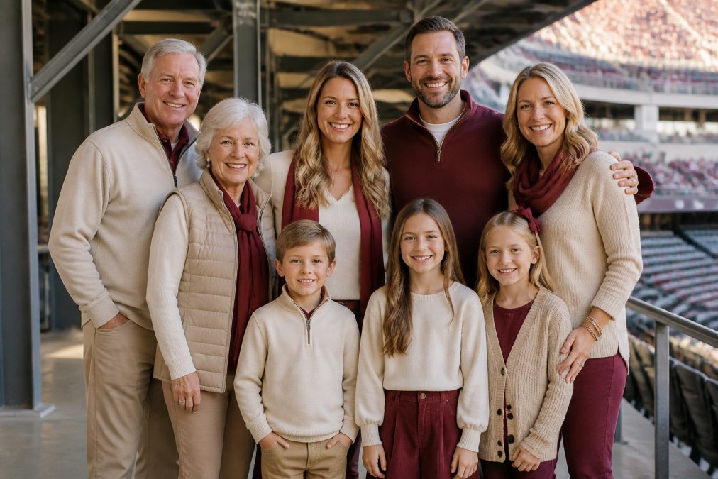
Family Game Day Outfit Ideas for All Ages
Age-Appropriate Styling for Large Groups
When you're coordinating matching family stadium photos across multiple generations, age-appropriate styling becomes critical. What works for a five-year-old will look ridiculous on a teenager, and what works for teenagers might look costume-like on grandparents.
For young children (ages 2-8), keep pieces simple and comfortable. A solid-colored t-shirt or lightweight sweater in your palette color, paired with comfortable pants or shorts, photographs well and allows kids to move freely. Avoid overly trendy pieces that will look dated immediately. Team-spirit apparel from Merch by Mary Ellen designed for kids works well here because it's made with game-day comfort in mind.
For school-age children and teenagers (ages 9-18), offer more style flexibility. A hoodie in a palette color, layered over a solid tee, photographs well and feels age-appropriate. Teenagers especially appreciate having some autonomy in how they style their coordinated pieces. A teen in a navy hoodie with cream accents looks intentionally coordinated without feeling forced into a family costume.
For adults, layering becomes your friend. An adult in a cream base layer with a coordinating cardigan or jacket creates visual interest and sophistication. This approach also solves the practical problem of temperature changes throughout a game. Adults can remove layers if they get warm without disrupting the color coordination.
For grandparents and older family members, comfort and ease of movement matter. Avoid anything too trendy or youthful. A well-fitting sweater in a palette color paired with comfortable pants photographs beautifully and allows older family members to enjoy the game without worrying about their clothing.
Budget-Friendly Coordination Strategies
Creating a coordinated family look doesn't require expensive matching sets. Many families successfully coordinate by shopping their existing wardrobes first, then filling in gaps with affordable basics.
Start by identifying pieces everyone already owns in your chosen palette colors. Cream, gray, navy, and black basics are staples most people already have. Before buying anything new, take inventory of what you can work with. A family of five might find that three people already own cream or gray tops, reducing what you need to purchase.
Fill gaps with affordable basics from mainstream retailers. A simple cream t-shirt costs just a few dollars and can be the foundation for multiple family members' outfits. Navy hoodies, gray sweaters, and white button-ups are inexpensive and timeless. You don't need designer pieces to create a cohesive, coordinated look.
Consider team-spirit pieces from Merch by Mary Ellen as your accent layer. Rather than buying matching outfits, buy one special piece, perhaps a custom team hoodie or personalized t-shirt, that serves as the visual anchor for your coordination. Everyone else wears neutral bases, and that one special piece ties the whole look together. This approach is significantly more budget-friendly than matching everyone completely while still creating a unified game-day appearance.
Thrift stores and online resale platforms offer additional budget options. Finding gently used pieces in your palette colors costs a fraction of retail prices. This approach is particularly useful for growing children whose clothes won't fit next season anyway.
Mixing Patterns and Textures Without Visual Clutter
Pattern mixing intimidates most people, but it's actually the secret to creating visual interest in coordinated family photos. The key is understanding which patterns work together and which ones create visual chaos.

The fundamental rule: limit yourself to two patterns maximum in your family's overall coordination. If one person wears a bold print, everyone else should wear solids. If two people wear patterns, those patterns should be in the same color family and different scales (one small-scale, one large-scale). Never have three family members in three different patterns, that creates visual clutter that reads as chaotic rather than coordinated.
Texture layering is where coordinated photos become visually sophisticated. A smooth cotton base layer paired with a textured knit sweater creates depth without pattern conflict. Fabric movement matters tremendously in stadium settings. Lighter fabrics that move with the breeze photograph better than stiff materials. A flowing cardigan over a solid base creates more visual interest than a rigid jacket, and it photographs more dynamically.
Mixing solid colors with one pattern works beautifully. A family where four people wear solids in your palette colors and one person wears a patterned piece in those same colors creates intentional coordination. That patterned piece becomes a focal point without overwhelming the composition. Stripes in your palette colors work particularly well because they're orderly rather than chaotic.
Avoid busy prints that compete with each other. Two families standing next to each other, each wearing different bold patterns, creates visual noise. Stick with either solids or one pattern per family to maintain clarity in the photo.
The Importance of Layers and Fabric Movement
Layering serves both practical and aesthetic purposes in stadium photography. Practically, layers allow family members to adjust to temperature changes without disrupting the coordinated look. Aesthetically, layers create visual depth and sophistication that flat, single-layer outfits cannot achieve.
The best layering strategy starts with a fitted base layer in a palette color, adds a looser middle layer for texture and movement, and optionally includes an outer layer for warmth or visual impact. A fitted cream t-shirt under a loose gray sweater creates more visual interest than either piece alone. The fitted base defines the silhouette while the looser outer layer provides texture and movement.
Fabric movement is particularly important in stadium settings where lighting is often harsh and unforgiving. Stiff, structured fabrics photograph flatly under artificial light. Softer fabrics with natural drape and movement photograph more dynamically. A cotton sweater with a slight drape photographs better than a rigid fleece, even if both are the same color.
Consider how different fabrics move under typical game-day conditions. A light scarf or open cardigan creates movement that photographs beautifully, especially if there's any breeze in the stadium. A structured jacket sits heavily and can look dated or costume-like. Soft, flowing layers feel modern and photograph naturally.
Layering also solves the practical problem of different family members having different temperature preferences. Some people run cold while others run warm. Layering allows everyone to be comfortable without needing different outfits. A person who's cold can wear a full sweater while someone who's warm can wear just the base layer, both are still coordinated because they're wearing palette colors.
Common Mistakes to Avoid When Coordinating Stadium Photos
Most families make predictable mistakes when coordinating stadium photos, and knowing what to avoid prevents wasted effort and disappointing results.
The biggest mistake is choosing colors based on how they look in person rather than how they photograph under stadium lighting. A color that looks perfect in your living room can appear completely different under artificial stadium lights. This is why testing your color choices under similar lighting conditions matters. Don't assume a color will photograph well just because you like how it looks on the hanger.
Another common error is overcomplicating the coordination. Families often think more matching equals better coordination, so they buy identical outfits for everyone. This frequently results in photos that look costume-like rather than naturally coordinated. The sweet spot is coordinated, not matched, everyone using the same color palette but with flexibility in how they style it.
Ignoring fit is a critical mistake. Ill-fitting clothes undermine even the best color coordination. A family where everyone wears the same color but in poorly fitting sizes looks awkward rather than unified. Ensure every family member's clothing fits well and flatters their body type. This matters more than having identical pieces.
Choosing pieces that are too trendy is another pitfall. That trendy oversized silhouette or fashion-forward color might look great now, but it will look dated in photos you want to treasure for years. Stick with classic pieces in timeless colors. Your coordinated family stadium photo should look good whether you view it in 2026 or 2036.
Forgetting about the stadium background is a mistake many families make. They coordinate their outfits without considering what's behind them. A color that clashes with the stadium's dominant colors (typically greens, grays, and team colors) will make your family look disconnected from the environment. Choose colors that complement rather than compete with the stadium backdrop.
Underestimating the importance of comfort is a practical mistake with visual consequences. If family members are uncomfortable, that discomfort shows in photos. They'll look tense or unhappy rather than relaxed and joyful. Choose fabrics and fits that allow everyone to move freely and feel confident.
Final Styling Tips for a Standout Photo Session
A few final considerations will elevate your coordinated family stadium photos from good to exceptional.
Accessories are your secret weapon for adding visual interest without disrupting coordination. A scarf, hat, or piece of team-spirit gear adds a focal point that draws the eye. Merch by Mary Ellen offers accessories specifically designed for game-day coordination, items that work with neutral bases while adding personality and team spirit.
Pay attention to hair and grooming. This seems obvious, but many families focus entirely on clothing coordination while neglecting how hair and grooming contribute to the overall look. Neat, intentional hairstyles photograph better than messy or overly styled ones. This doesn't mean everyone needs the same hairstyle, just that each person's hair should look intentional rather than accidental.
Posing matters tremendously in coordinated photos. Rather than stiff, formal poses, encourage natural, relaxed positions. A family sitting naturally in stadium seats, leaning toward each other, and genuinely smiling photographs better than a stiff lineup. The coordination should feel like a natural part of being together at the game, not a costume for photos.
Timing your photo session strategically makes a difference. If possible, shoot during times when stadium lighting is most forgiving. Early afternoon games with natural sunlight streaming through stadium openings photograph better than evening games under pure artificial light. If you're stuck with artificial lighting, position yourselves to minimize harsh shadows.
Finally, have realistic expectations about what photos will look like. Even perfectly coordinated families won't look flawless in every stadium photo. Some angles will be better than others. Some lighting conditions will be more forgiving than others. The goal is to look intentionally coordinated and genuinely happy, not to achieve perfection. Those are the photos that matter most, the ones that capture your family enjoying the game together, looking unified and proud.
Coordinating matching family stadium photos requires understanding how lighting, color, and fabric interact in a challenging environment. The approach you choose, matching versus coordinating, depends on your family's size, ages, and preferences. Start with a strong color palette that works under artificial light, layer thoughtfully for visual depth, and remember that coordination doesn't require identical pieces. When you're ready to add team spirit to your coordinated look, Merch by Mary Ellen offers personalized apparel and accessories designed for families who want to celebrate their favorite sports with style and intention. Whether you're choosing custom team gear or coordinating neutral bases with accent pieces, the goal is photos that capture your family's unity and joy, and that starts with understanding the unique challenges of stadium photography.
Frequently Asked Questions
Should families wear matching jerseys for stadium photos?
Matching jerseys create strong visual harmony in stadium photos, but coordinating outfits with a cohesive color palette works equally well. If matching feels too rigid for your family's style, choose solid colors or complementary colors in your team's palette instead. The key is ensuring everyone looks intentional together, whether that's identical pieces or a unified color scheme. Matching works best for younger children and formal occasions; coordinating offers more flexibility for extended family groups with varied ages and preferences.
What colors look best for stadium family photos?
Neutral tones like white, black, gray, and navy provide excellent color balance against most stadium backgrounds and natural lighting conditions. Team colors work well when they're not too bright or neon, as stadium lighting can intensify bold prints and create color cast issues. Avoid colors that blend with the field or bleachers. Test your color choices in stadium lighting if possible, or choose complementary colors that pop without overwhelming the photo. Solid colors photograph better than busy patterns in outdoor stadium settings.
How do you coordinate family outfits for a sports game without looking cheesy?
Skip matching outfits entirely and focus on a coordinated color palette instead. Have each family member wear well-fitting clothes in the same 2-3 colors or neutral tones. Add visual interest through texture layering and accessory coordination, like team hats, scarves, or personalized apparel, rather than identical pieces. Keep patterns minimal and choose one standout piece per person. This approach creates visual harmony without appearing overly coordinated or costume-like, and it works especially well for large extended family groups.
What should you avoid wearing for stadium family photos?
Avoid busy patterns, neon colors, and oversized clothing that creates visual clutter in photos. Don't wear solid colors that match the field or bleachers, as they'll blend into the background. Skip clothing with distracting logos or text unless they're team-related. Avoid fabrics that don't move naturally or fit poorly, as they photograph stiffly. Don't mix more than two patterns per outfit, and steer clear of white backgrounds if your stadium has bright white seats or walls, as it can create harsh lighting and color cast problems in your photos.
This article was written using GrandRanker