

Table of Contents
- Start With a Strong Design Brief
- Sketch Your Initial Team Logo Concepts
- How to Choose Team Colors and Typography
- Explore Free Team Logo Maker Tools
- Generate Sports Team Logo Ideas and Refine Your Design
- Export Your Logo in the Right File Formats for Printing
- Avoid Common Logo Design Mistakes
- Get Team Input and Finalize Your Design
- Frequently Asked Questions
Last Updated: October 10, 2026
Start With a Strong Design Brief
A strong design brief answers the core questions you'll need to solve before you design custom team logos or touch any design software.
Define your team's identity: sport, values, and tone (bold and aggressive, or friendly and approachable). Write these down to guide every decision.
Consider where your logo will appear: jerseys, hats, equipment bags, or all three. A logo that looks great at 12 inches might fall apart at 2 inches. Know this upfront to avoid redesigning later.
Document existing team colors and note any symbols or mascots your team wants to feature, animal, letter, or abstract shape.
Set a realistic timeline. A two-week tournament requires a tighter workflow than two months. Clear deadlines help you make faster decisions.
Sketch Your Initial Team Logo Concepts
Sketching forces you to explore multiple directions quickly without technical details. Don't skip this step.
Spend 20-30 minutes sketching at least five different logo concepts. Messy sketches are fine, you're exploring possibilities, not creating finished art.
Sketch different interpretations of your mascot: realistic, geometric, or profile. Variety helps you find the right direction.
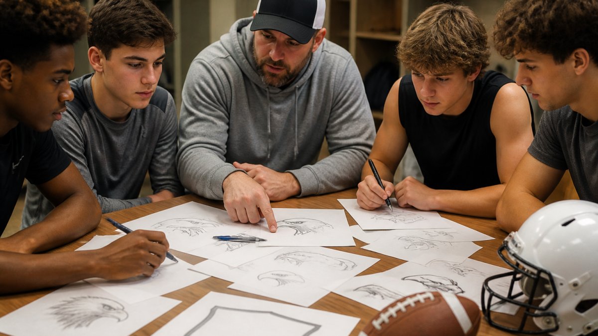
Brainstorm mascot and emblem ideas
Your mascot is the personality of your logo. Common choices: animals (eagles, bears, wildcats), abstract symbols (shields, stars, lightning bolts), or letters (initials or team numbers).
Choose what matches your team's identity: fierce animals convey strength, shields suggest tradition, stylized letters feel modern.
Write down 5-10 mascot ideas and sketch at least two visual interpretations of each.
Draft multiple rough sketches
Create 10-15 rough sketches with variety: different compositions, proportions, and detail levels. Some simple and bold, others intricate.
Don't judge yet. The goal is volume and exploration. Many professional designers create 20+ sketches before settling on a direction.
Step back and review all sketches. Circle your top three to five that capture your team's personality. These are your finalists.
How to Choose Team Colors and Typography
Color and typography are the voice of your logo. They communicate before anyone reads the team name.
Select a color palette that stands out
Your team colors must work on apparel, equipment, and digital spaces. A color that pops on a t-shirt might disappear on a hat.
Use strong contrast: light on dark or dark on light. Navy and gold work well. Similar brightness (navy and forest green) looks muddy.
Test colors at different sizes (2 inches and 8 inches). If you can't distinguish three colors at small sizes, simplify to two.
Consider how colors print on apparel. Darker colors are more durable; bright neons fade. This matters for gear lasting a season or more.
Pick fonts for readability and brand identity
The right font amplifies your message; the wrong one weakens it.
Choose fonts easy to read at all sizes. Avoid decorative or script fonts for the main team name; save those for accents.
Use two fonts: primary (bold and distinctive) for the team name, secondary (clean and simple) for supporting text.
Test fonts on screen and in print. Stick with fonts that have good spacing and clear letterforms.
Explore Free Team Logo Maker Tools
Free design tools offer templates, shapes, icons, and text layers to build a professional logo without expensive software or a steep learning curve.
Getting started with templates
Explore free design platforms with logo templates. Search for "sports logo template" or "team emblem template."
Pick a template close to your vision. Avoid templates completely different from your concept.
Customizing shapes, icons, and text layers
Customize your template: change colors, edit text, add icons, resize and reposition elements, and layer them.
Spend time layering elements. The composition, how elements are positioned relative to each other, makes or breaks a logo.
Generate Sports Team Logo Ideas and Refine Your Design
Now you're moving from rough concept to refined design. This is where your sketches and template customization come together into something polished.
Common logo symbols and what they communicate
Animals signal strength and fierceness. Shields and crests communicate tradition and honor. Geometric shapes feel modern and scale well. Letters or numbers are direct and personal.
Testing scalability and contrast
Test your design at multiple sizes. A logo that looks good at 8 inches might fall apart at 2 inches.
Customized One Team. One Heart. One Goal. Baseball Kids T-shirt →
Print your logo at 2, 4, and 8 inches. If details disappear or blur at small sizes, simplify your design.
Print your logo in black and white. A strong logo works without color, then becomes better in color.
Test on different backgrounds. Print your logo on white paper, then on dark paper. Does it work both ways? If your logo is dark blue, it might disappear on a navy t-shirt. If it's light gold, it might fade into a white background. Adjust colors or add an outline to fix contrast issues.
Export Your Logo in the Right File Formats for Printing
This is where many DIY designers stumble. You've designed a great logo, but if you export it in the wrong format, it won't print well. Different uses require different file formats.
Vector versus raster: which format to choose
Vector graphics are made of mathematical formulas. They scale infinitely without losing quality. A vector logo looks perfect at 2 inches and perfect at 20 feet. Vector files end in .ai.eps, or .svg.
Raster graphics are made of pixels. They have a fixed resolution. A raster logo looks good at one size but gets blurry when enlarged. Raster files end in .png.jpg, or .gif.
For team logos, vector is almost always better. When you print your logo on apparel through a custom printing service, they need vector files to get crisp, clean results. If you only have raster files, the logo will look pixelated or blurry.
Most free design tools export in both formats. Export your final logo as a vector file (.svg or .eps) first. This is your master file. Keep it safe. Then export a raster version (.png at 300 DPI) for web use and digital sharing.
Resolution and DPI requirements for apparel
When your logo prints on a t-shirt or jersey, resolution matters. DPI stands for dots per inch. Higher DPI means crisper, cleaner printing.
For apparel printing, aim for 300 DPI minimum. This is the standard for professional printing. If your logo is only 72 DPI, it will look fuzzy and low-quality when printed.
Here's what this means in practice: if your logo is 4 inches wide, your raster file should be at least 1,200 pixels wide (4 inches × 300 DPI = 1,200 pixels). Bigger is fine, you can always reduce size. Smaller than this and you'll see quality loss.
When you export from your design tool, check the export settings. Look for resolution or DPI options. Set it to 300 DPI. Then save your file as PNG (which preserves transparency) or PDF (which works well for print shops).
Avoid Common Logo Design Mistakes
Learning from others' mistakes saves you time and frustration. Here are the pitfalls we see most often.
Too much detail. Logos with dozens of small elements don't scale down well. At 2 inches, all that detail becomes a muddy blob. Simplify.
Poor color choices. Colors that look great on a screen sometimes look terrible in print. Test your colors in print before finalizing.
Unreadable text. If your logo includes text, make sure it's legible at small sizes. Thin, decorative fonts often fail this test.
Inconsistent sizing. If you're using a mascot and text together, make sure they're proportional. A tiny mascot next to huge text (or vice versa) looks unbalanced.
Forgetting the black and white test. A logo that only works in color is incomplete. Always test your logo in black and white. If it falls apart, fix it.
Using copyrighted imagery. Don't use clipart, stock images, or elements from other logos without permission. This creates legal issues and makes your logo unoriginal.
Get Team Input and Finalize Your Design
Your logo is for your team, so get their feedback before you finalize. You might love your design, but if your team doesn't, it won't feel like theirs.
Share your top two or three logo options with your team. Ask for honest feedback. What works? What doesn't? Does it feel like your team? Make adjustments based on the most common feedback.
Once you've settled on a direction, lock it in. Make small refinements (tweaking colors, adjusting spacing, cleaning up lines), but avoid major changes at this stage. Endless revisions drain energy and delay launch.
When you're happy with your logo, export it in all the formats you'll need: vector for printing, high-resolution PNG for digital use, and a small version for social media icons.
Now that you know how to design custom team logos, you're ready to bring your logo to life on apparel. Our Customized One Team. One Heart. One Goal. Baseball Kids T-shirt is a perfect example, it lets you add your team name, division, and player numbers to create gear that's truly yours. The same customization works for basketball and softball too.


Designing a custom team logo takes planning, but it's worth the effort. A strong logo becomes part of your team's identity. It's what people remember. It's what builds pride and unity.
| Step | Time | Key Deliverable |
|---|---|---|
| Design Brief | 30 minutes | Written brief with team identity and requirements |
| Sketching | 1-2 hours | 10-15 rough concept sketches |
| Color & Typography Selection | 1 hour | Chosen color palette and fonts |
| Template Customization | 2-3 hours | Refined logo in design tool |
| Testing & Refinement | 1-2 hours | Logo tested at multiple sizes and backgrounds |
| Export & Finalization | 30 minutes | Vector and raster files ready for printing |
Total Time: 6-10 hours (spread across several days for best results)
Frequently Asked Questions
What's the best free tool to design a custom team logo?
Many free team logo makers offer templates, customizable icons, and drag-and-drop editors that require no design experience. Look for tools that let you adjust colors, fonts, and shapes, then export in high resolution. Most free options work well for small-to-medium projects, though paid versions unlock more advanced features like custom vector editing and premium icon libraries.
What file format should I use when exporting my team logo for apparel printing?
Vector formats like SVG or PDF are ideal because they scale without losing quality. If your design software only exports raster files, use PNG with a transparent background at 300 DPI minimum. For screen printing on apparel, ask your printer whether they prefer vector (EPS, AI) or high-resolution raster (PNG, TIFF). Always provide a version with a transparent background so the printer can separate colors.
How do I make sure my team logo looks good when printed on shirts and hats?
Test your design at multiple sizes, print it small (2 inches) and large (8 inches) to check readability. Ensure colors have high contrast so details don't disappear on dark fabrics. Avoid thin lines under 2 points thick, as they may not print cleanly. Get feedback from your team before finalizing, and ask your apparel printer for a proof or sample before committing to a full order.
Can I avoid copyright or trademark issues when designing a team logo?
Create original artwork instead of copying existing logos or mascots. Avoid using trademarked symbols, professional sports team colors, or well-known brand icons. Research your team name and chosen symbols online to confirm no other local team uses them. If you're unsure, consult your league or organization, many have guidelines about logo originality. Custom designs that reflect your team's unique identity are always the safest choice.